Hey there. I’m Bárbara, a Digital Designer from Portugal. My work is focused in new ways of seeing and purposeful narratives.
With 9 years of professional experience, I have shaped my expertise around the pursuit of visual, interactive, and technical solutions that elevate people’s experience within the digital world. Throughout my career, I've expanded not only my design skills, with a special focus in digital design, but also explored areas such as team management, design leadership, and art direction.
A crucial side of my journey has been a close contact with different teams and clients. Besides enhancing my communication skills, this also allowed me to develop a keen ability to interpret and translate ideas into tangible digital experiences. I aspire to keep exploring the fields of user experience, user interface, product design, branding, and art direction, where I can (hopefully) continue to make an impact.
A collection of projects made in collaboration with different brands and agencies, where I explored strategy, branding, digital, and everything in-between.
- DeepJudge with Better Mistakes — Freelance


 1—4
1—4From document overload to instantly searchable files
DeepJudge is an AI-powered platform transforming how legal professionals search and access knowledge. The project began as a website redesign, but it quickly became very clear that the existing brand lacked a strong visual language. To create a more cohesive, impactful and premium digital presence, I led a full brand revamp alongside the website redesign.
I was responsible for refining the logo, defining a new typographic system, expanding the color palette, and creating a set of visual elements that gave the brand a more confident, premium, and bold identity. The result is a brand and website that feel established, credible, and distinct—reinforcing DeepJudge’s position as a leading AI solution for legal professionals.
seeWebsiteHere ↗ - Reckon with Sr. Studio — Freelance


 1—5
1—5The grid that learned to move
Reckon.ai is a B2B technology company transforming retail with automated shopping experiences. The project began with a brand revamp and evolved into a complete system redesign—spanning identity, website, and all supporting materials. The goal was to create a brand that feels professional, credible, and scalable, while capturing the adaptability at the heart of Reckon’s technology.
The logo was refined into a stronger, more confident symbol, while the color palette expanded to allow versatile combinations. A modular grid system became the foundation of the identity, mirroring Reckon’s ability to adapt to each retailer. For imagery, I developed a new direction with MidJourney—warm, minimal, and premium—designed to convey the human-centered experiences Reckon provides.
seeWebsiteHere ↗ - Banyan at Onda Studio
 1—5
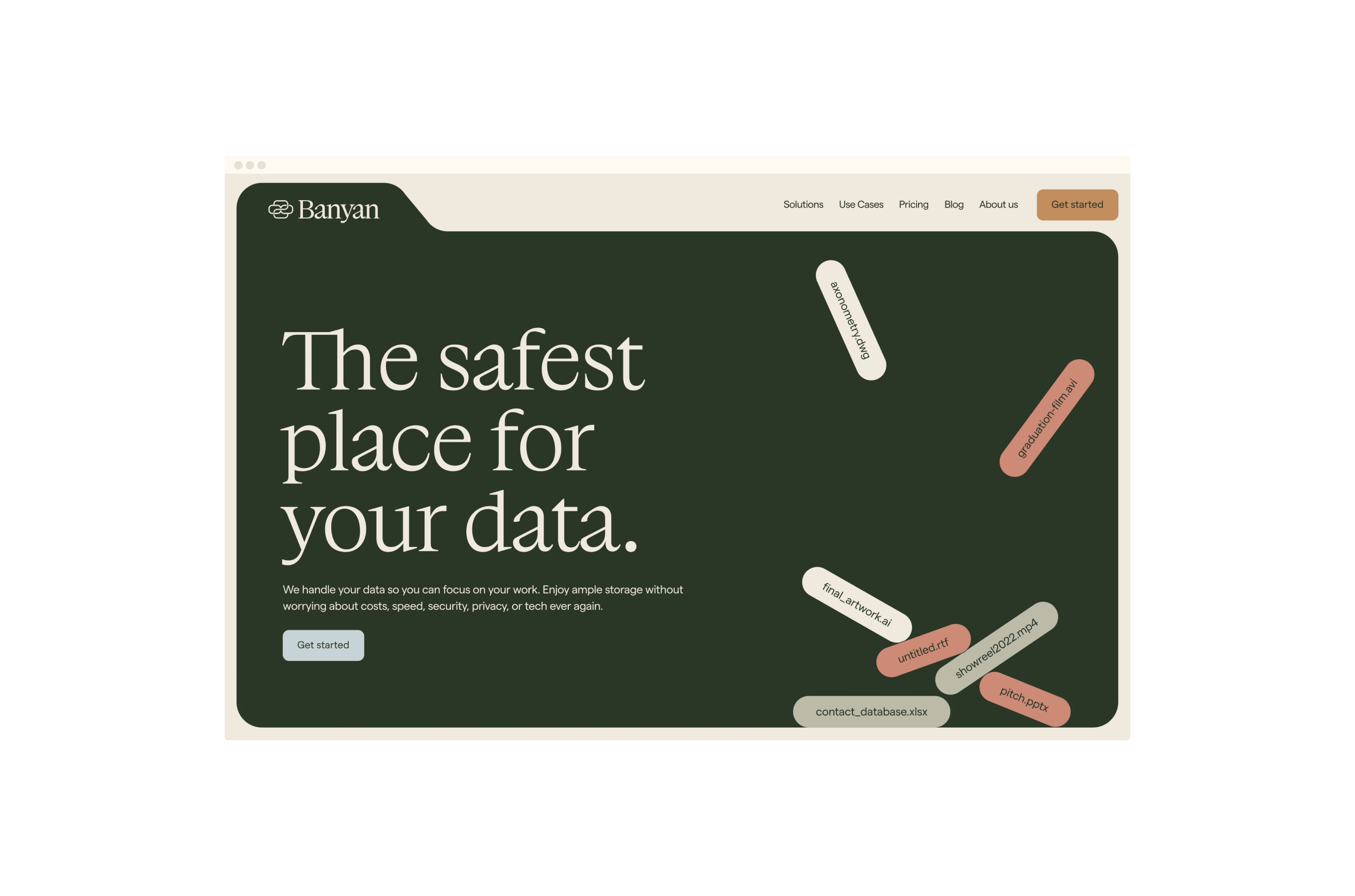
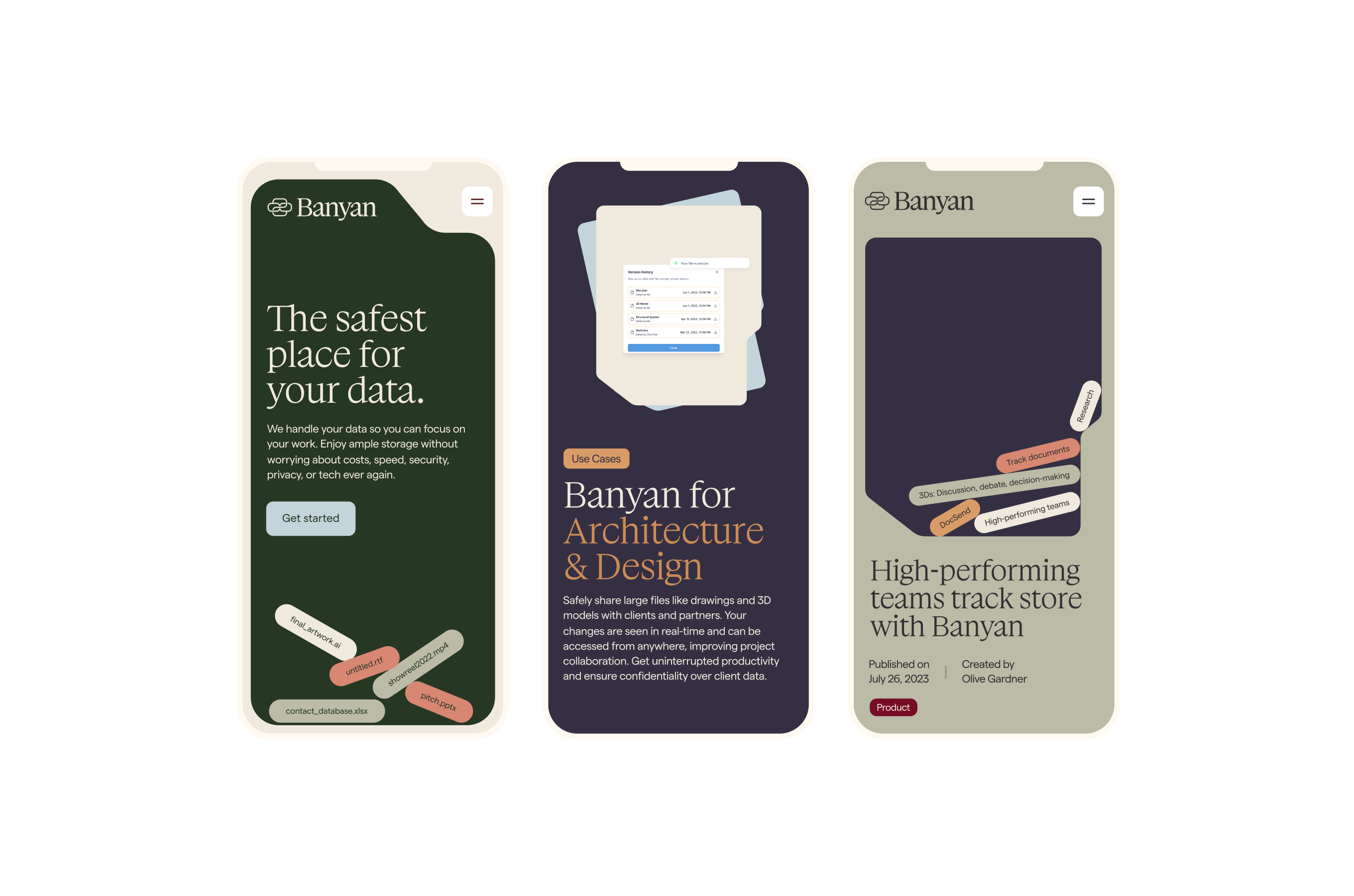
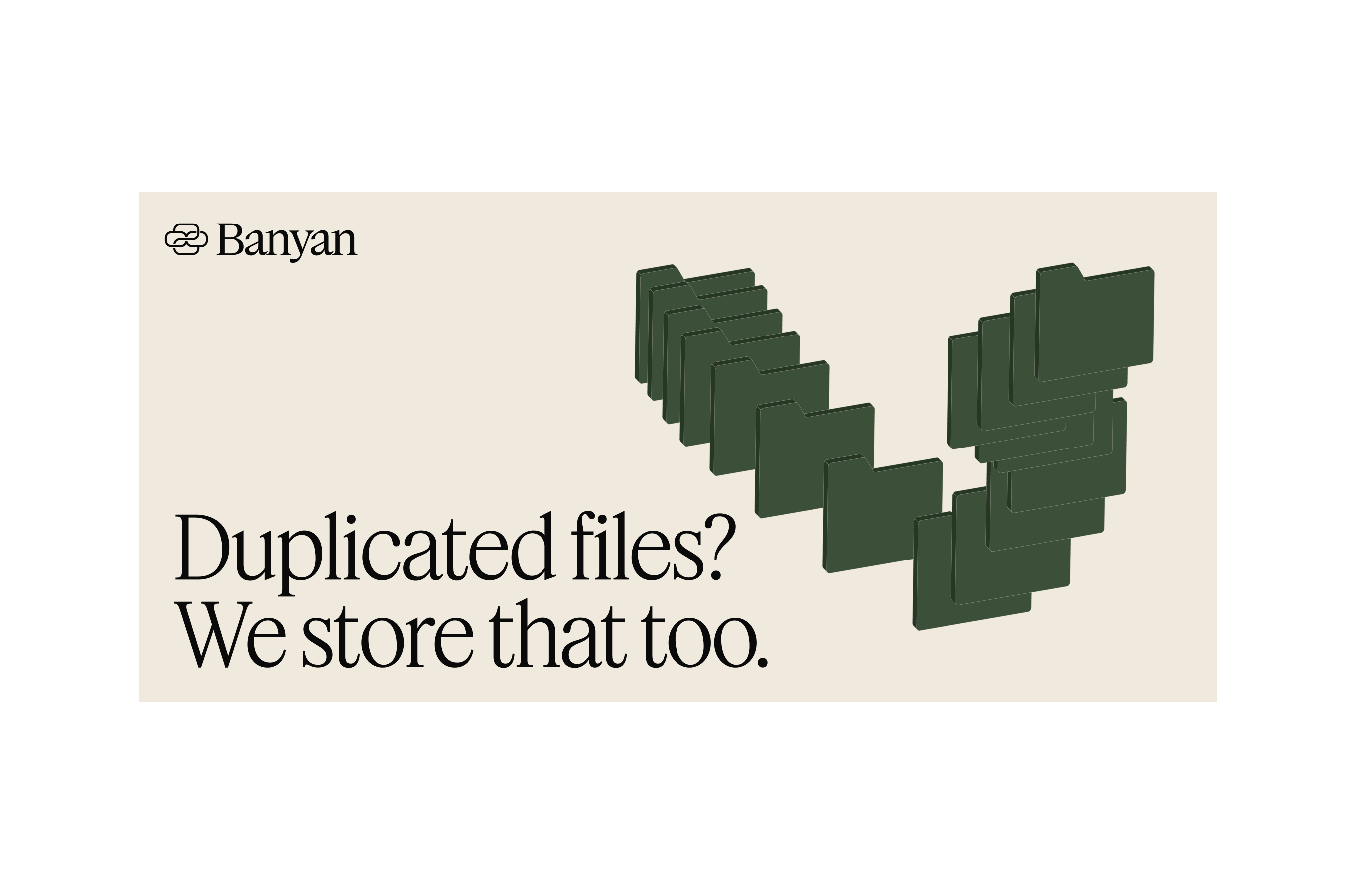
1—5Yesterday’s storage nostalgia & the technology of the future
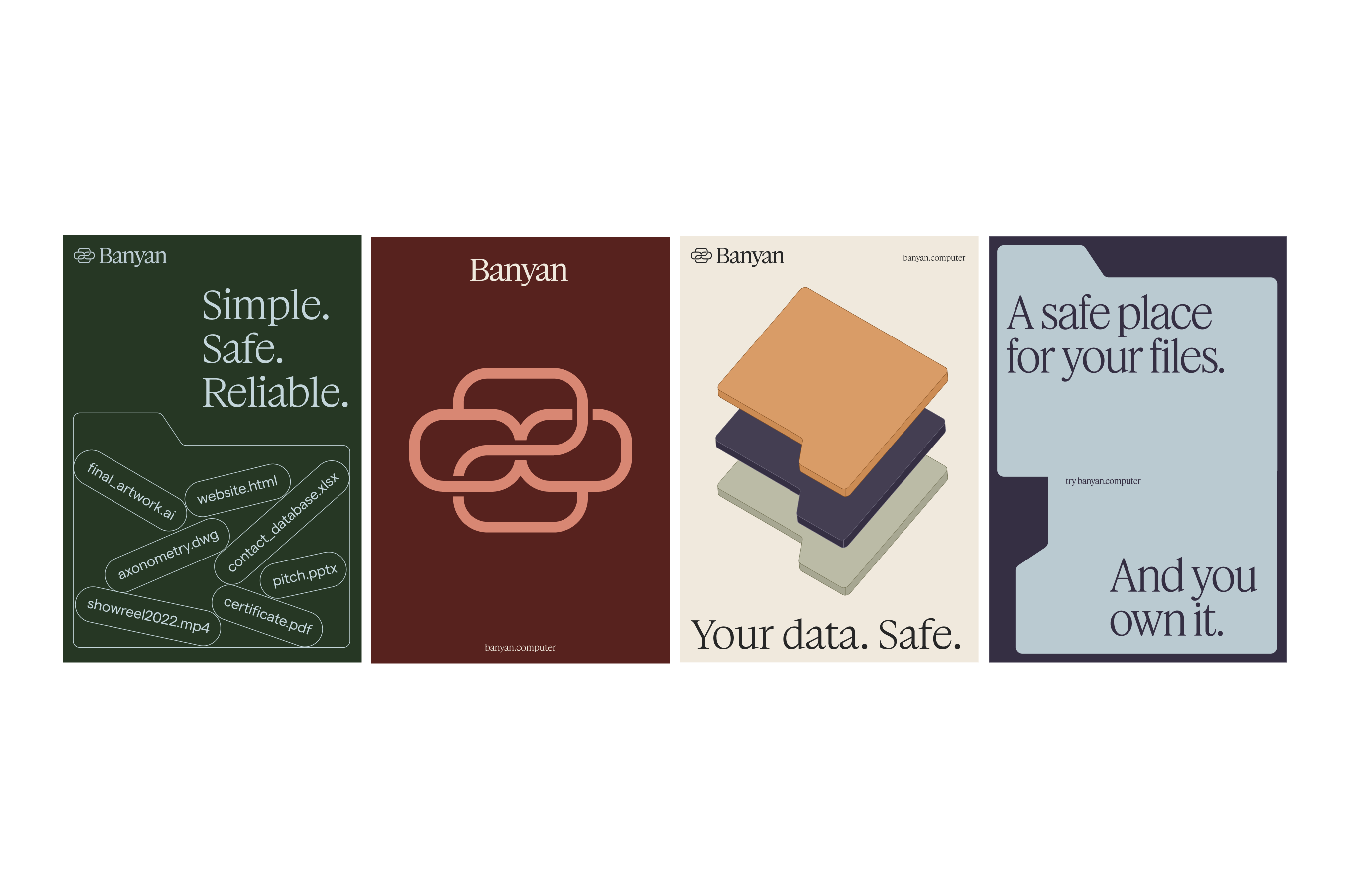
Together with the Onda Team, we worked on the brand identity and website for a new company — Banyan — focused on providing decentralized data storage. We worked upon the concept of the banyan tree — a tree that grows additional trunks from special roots, enabling it to spread outward without limits. We took this growth pattern as a representation of expansion and decentralization and used it to explore Banyan’s brand identity.
The symbol aims to express the idea of interconnectedness and continuity. Every element of the brand identity works to represent the interconnection between the convenience of digital technology and the nostalgia and ease of traditional storage systems — the colour palette, the quirky serif font, the illustrations — all of them aim to communicate the past and future of storage.
seeWebsiteHere ↗ - Aura at Onda Studio
 1—5
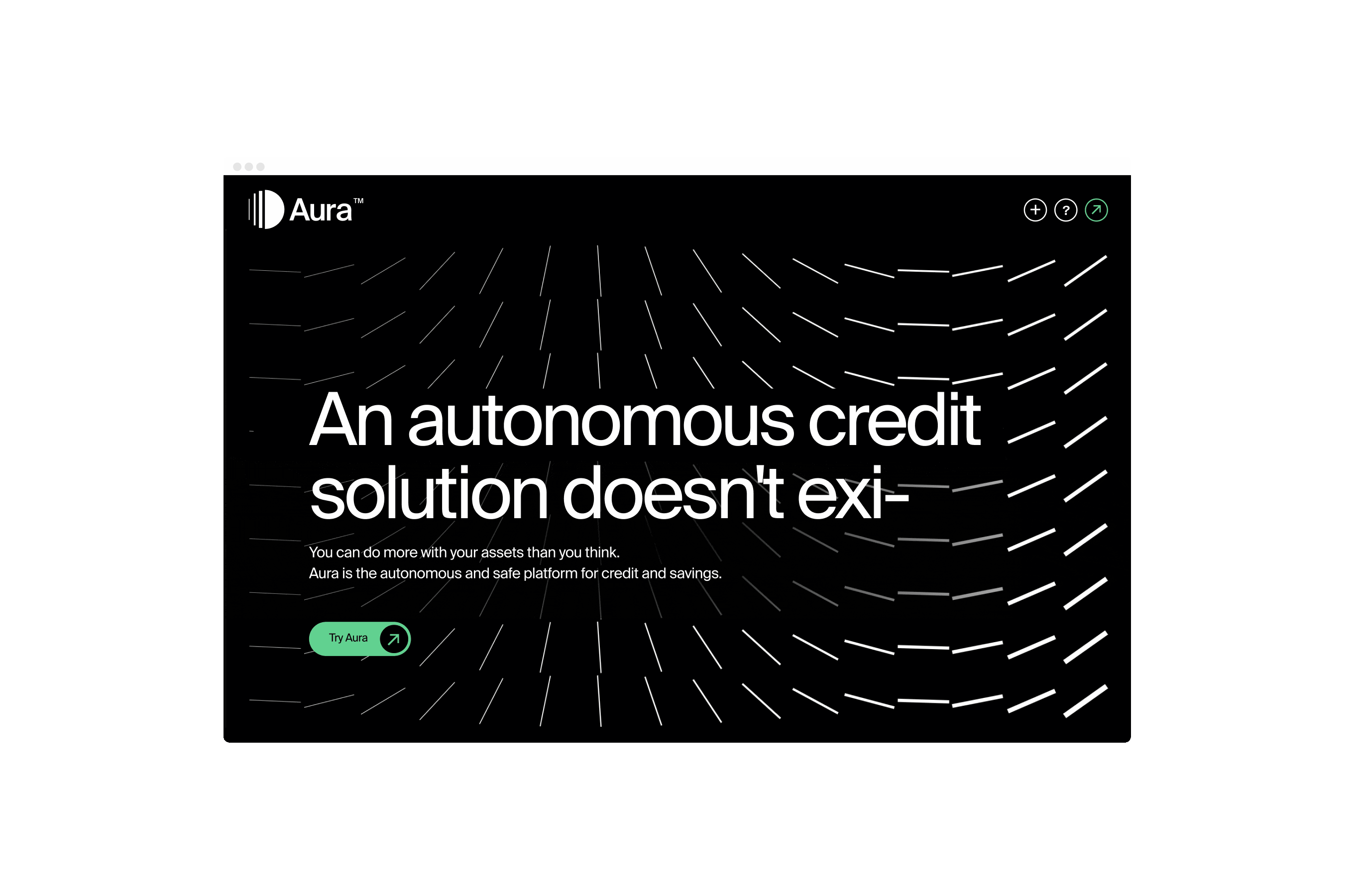
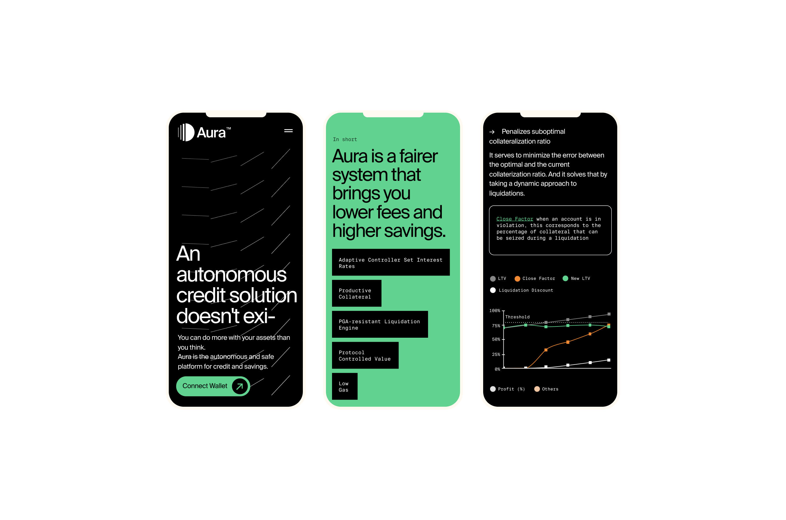
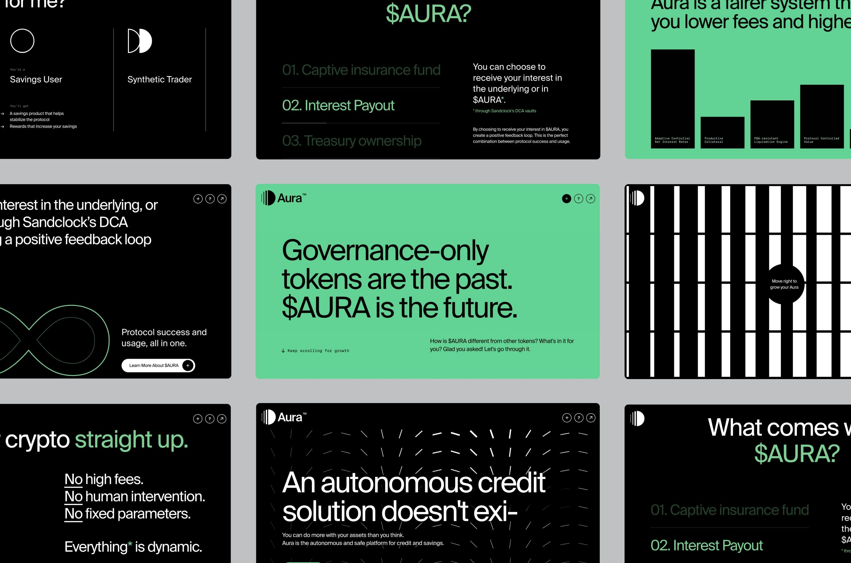
1—5Everything flows, nothing stands still
As a lead designer at Onda Studio, I was challenged to create the brand identity, strategy and website design for Aura. We explored the concept of transformation and metamorphosis throughout the brand identity and website, to represent the growth and energy transfer among people. The symbol explores the relationship between empty and fullness, an optical illusion of movement that conveys the idea of evolution.
We explored motion graphics, creative coding, micro animations and interactions to provide a truly engaging and immersive scroll experience for the user. The combination of black, white and bright green paired with the sans-serif Suisse Int’l, adds the final piece — a technological and ultra-modern feel — to the identity.
seeWebsiteHere ↗ - Cubist at Onda Studio
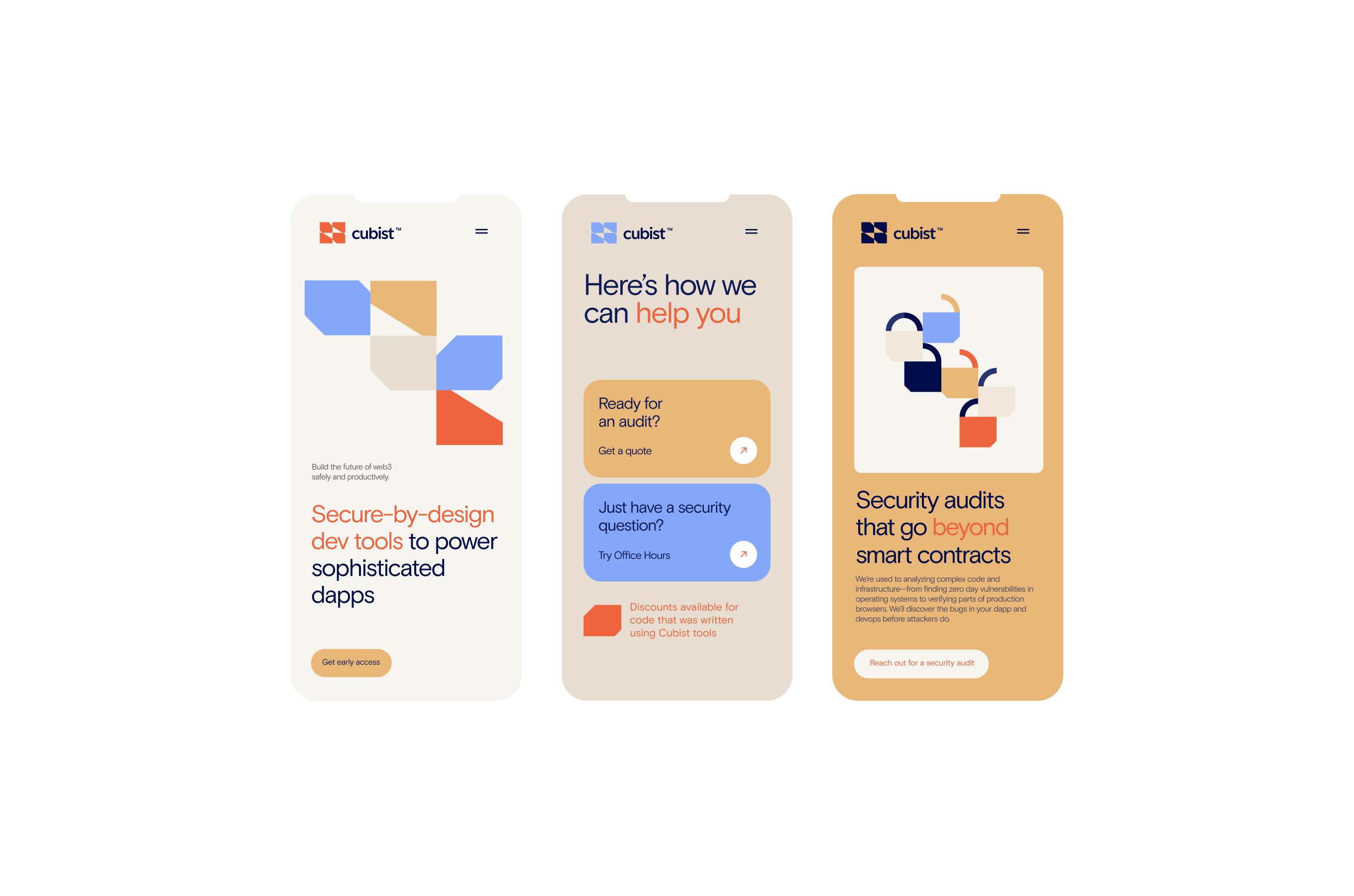 1—5
1—5Creating new beginnings by combining unusual parts
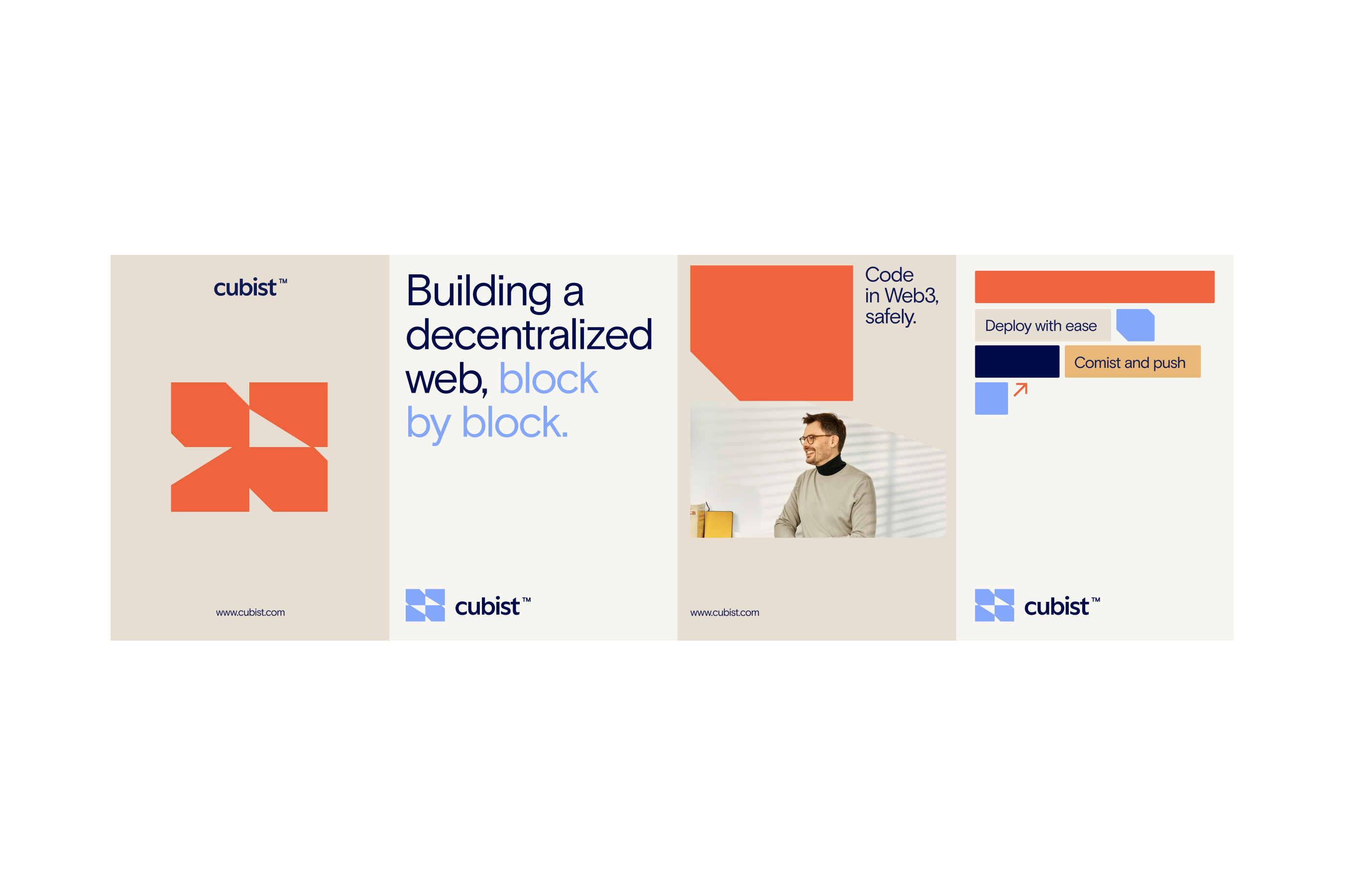
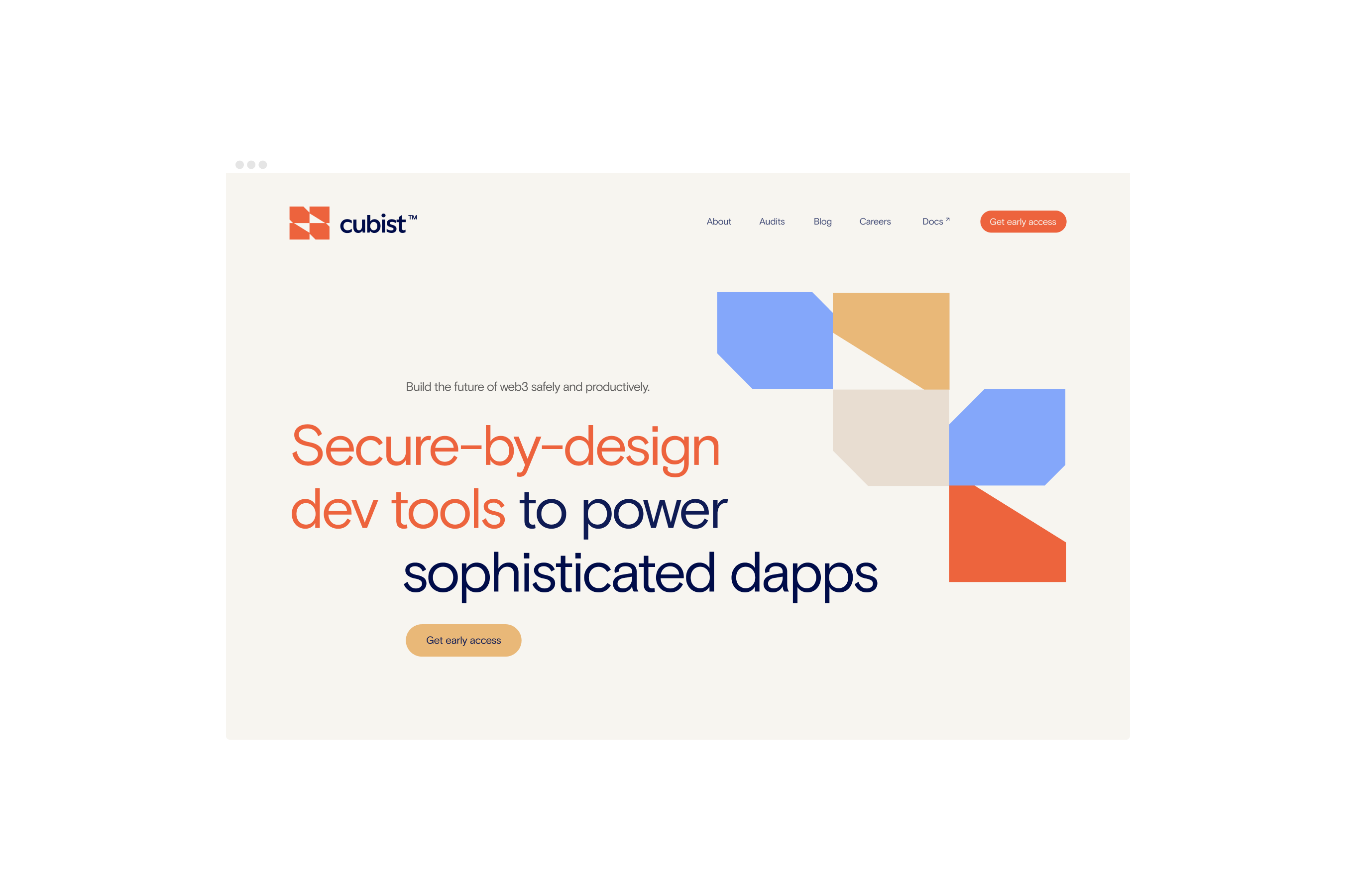
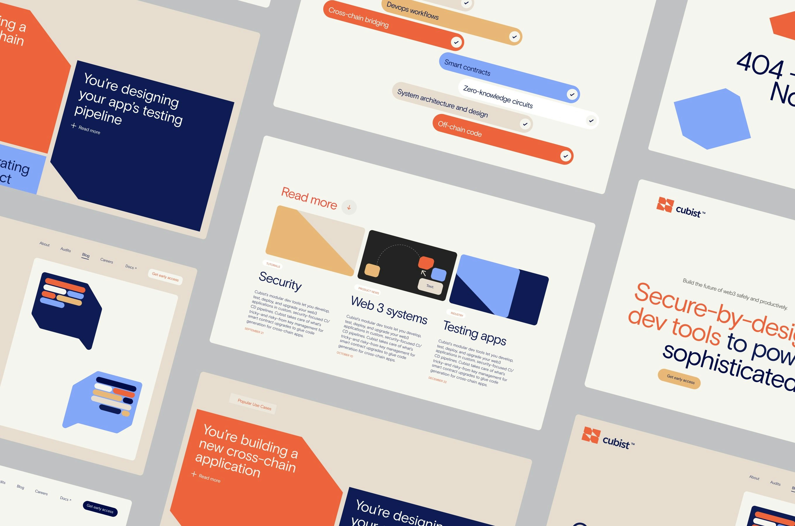
Cubist is a web3 development and deployment platform that seeks to allow developers to use familiar programming languages and integrated services for building and deploying applications. By exploring Cubism fragmentation concept as an art form, we crafted a narrative that represents a place where developers can connect different languages, and build the future of the web.
Visually, we wanted the brand to feel human and relatable, so we brought a palette of earthy and vivid colours combined with a quirky sans-serif typeface. We created several illustrations based on the logo’s elements and used them in multiple scales and colours to communicate attributes and values such as: security, dialogue and community. This helped us to add a more diverse and expressive voice to the brand.
seeWebsiteHere ↗ - Finiam at Onda Studio
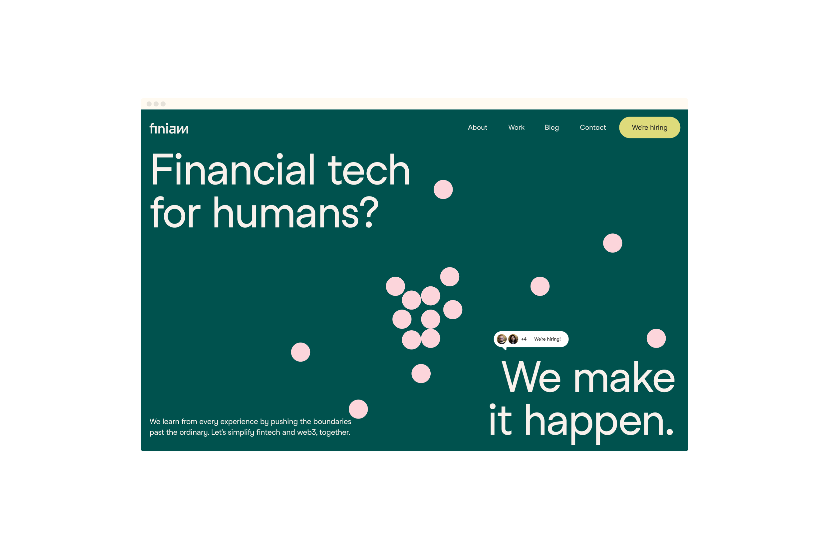
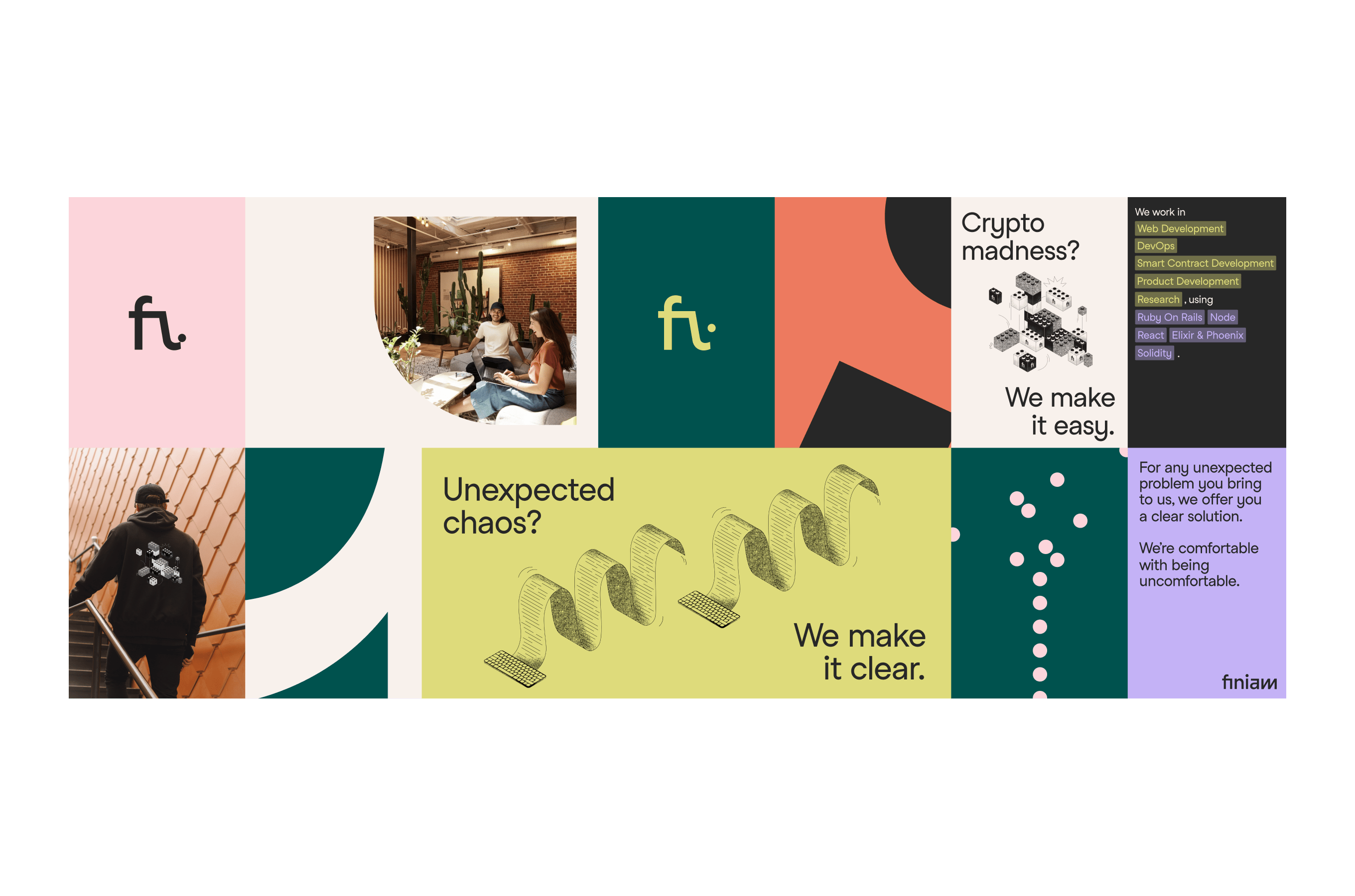
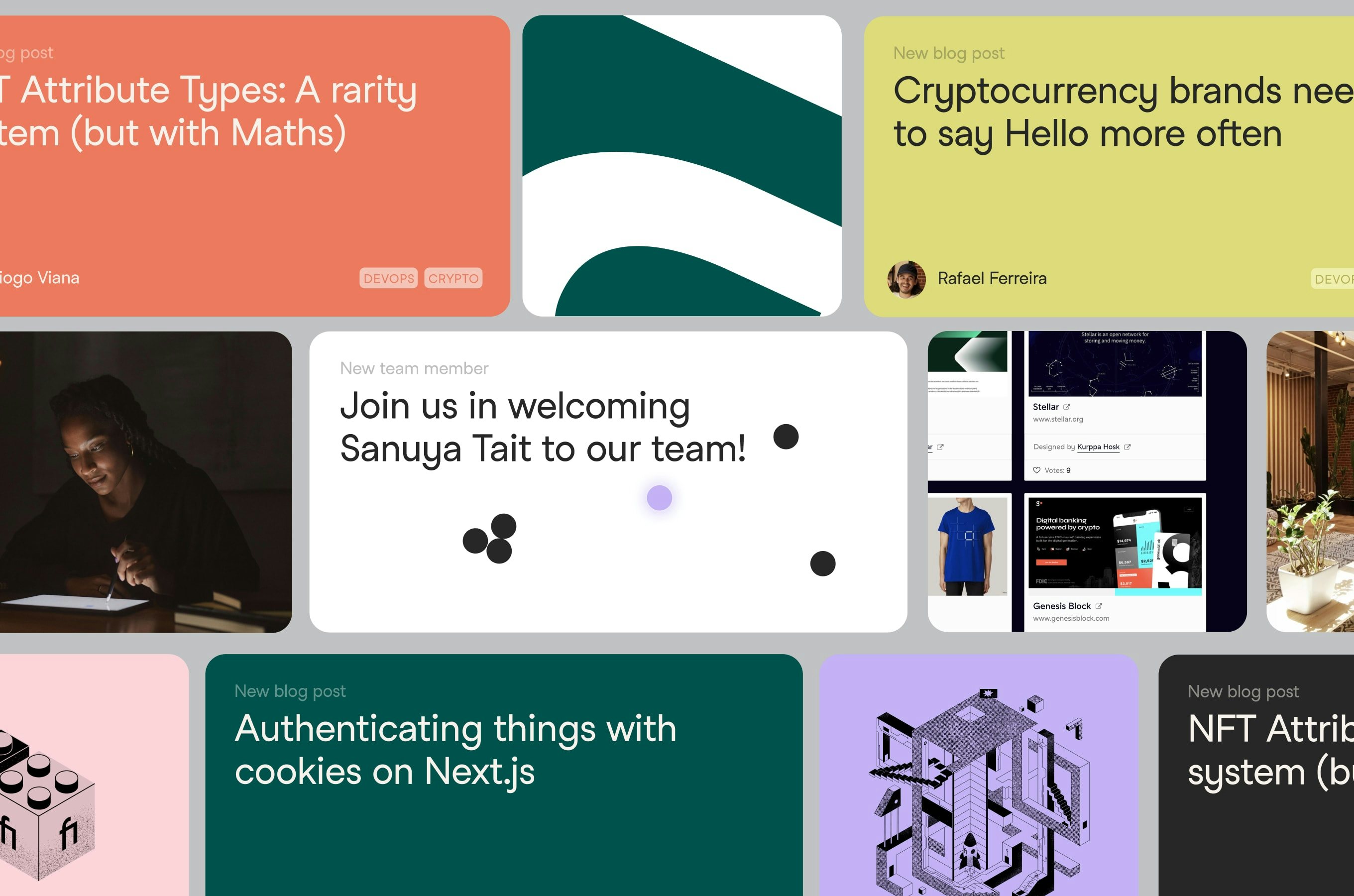
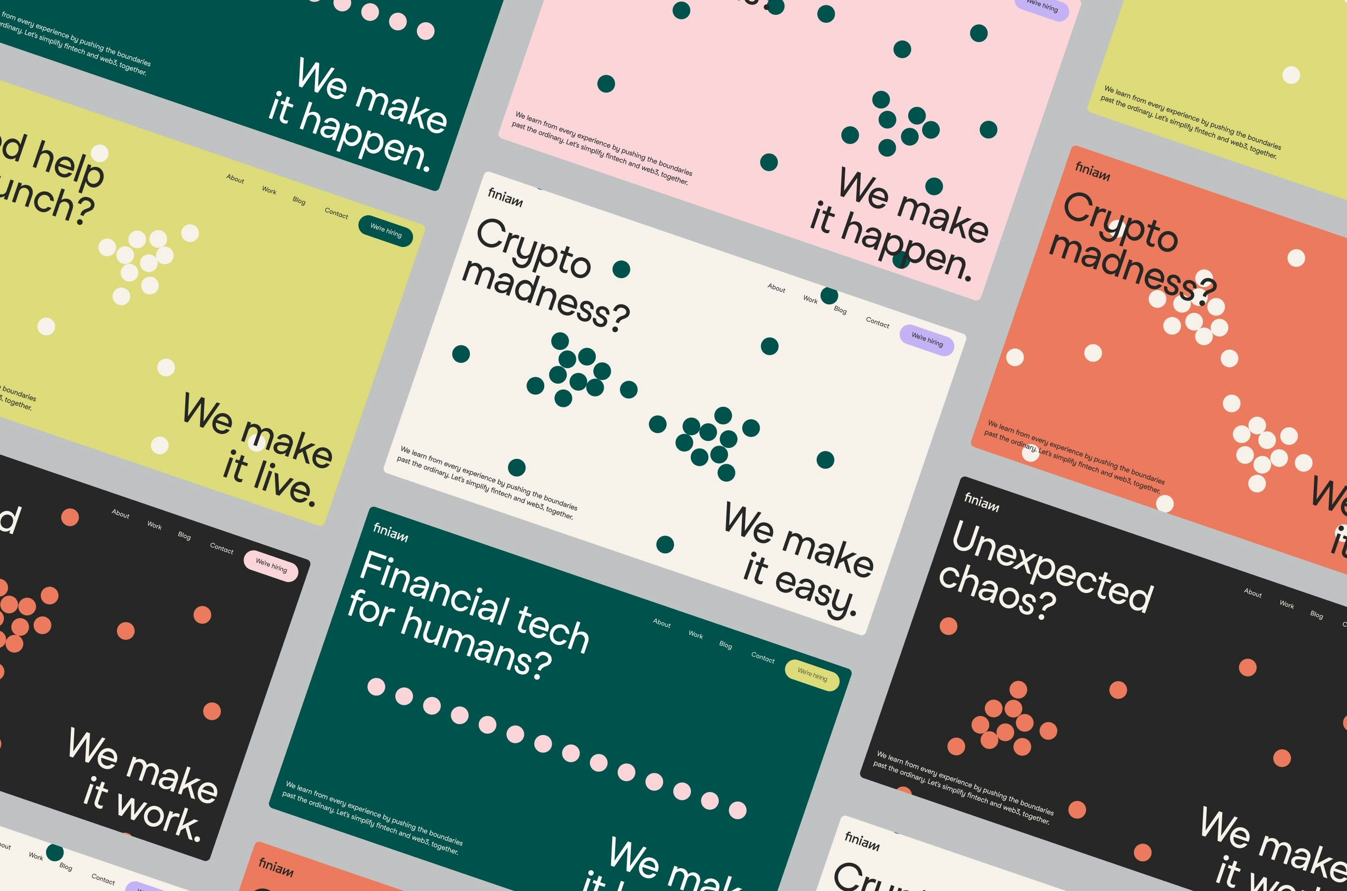
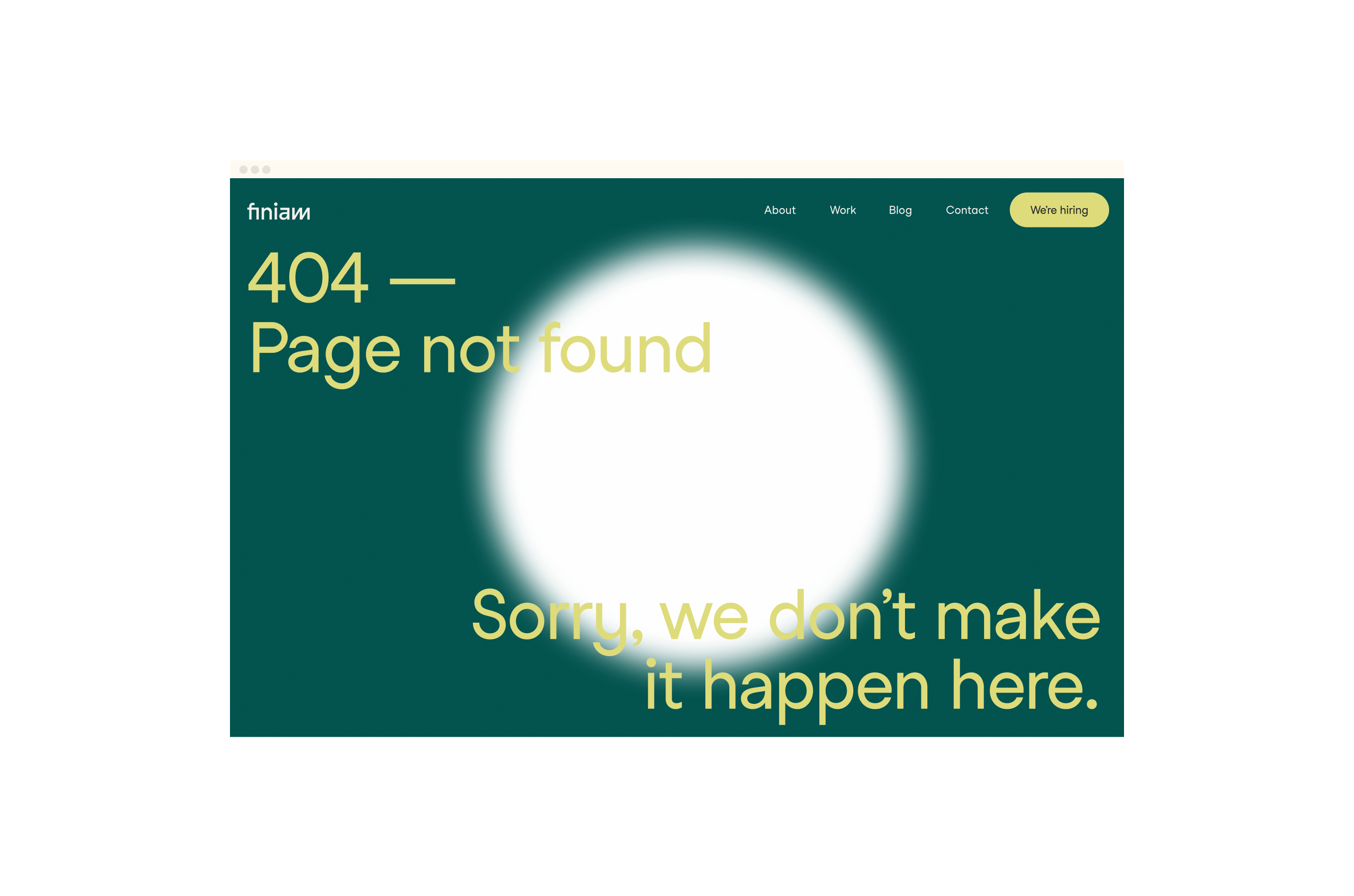
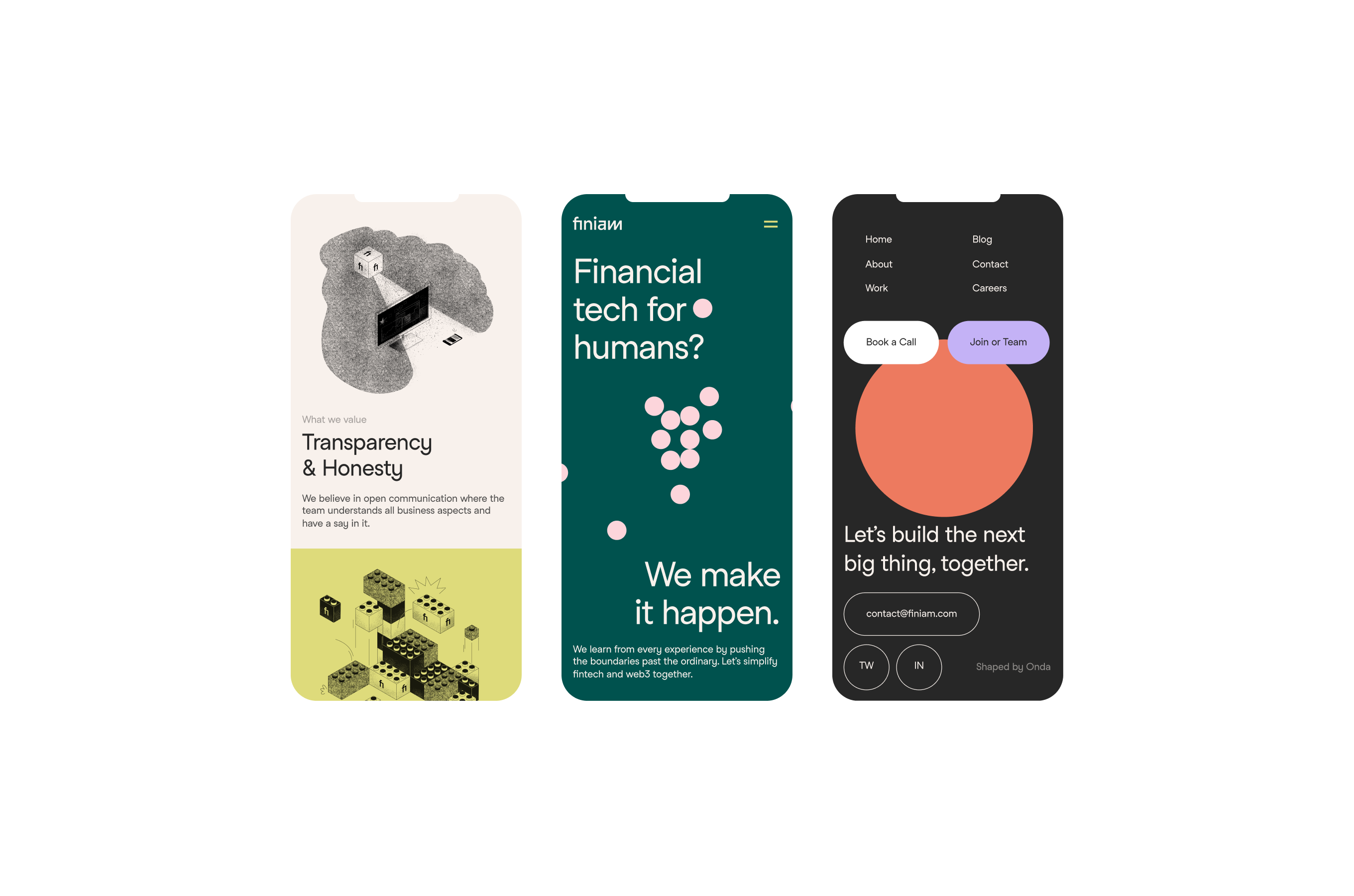 1—6
1—6Financial tech, but make it friendly
Finiam is a small and curious dev team focused on fintech products. I worked as lead designer to positioned them as they are: human, approachable, and skilful. We expanded their visual identity by adding colour, movement, motion, and illustration to the brand. In the past they were very dependent on the use of a single colour — purple — so we explored a large range of tones to allow a more dynamic and versatile use of the brand.
We explored the use of hand-drawn-like illustrations, and the website features different hero versions, so each user can have a surprising experience while opening the website. All of these allowed us to expand Finiam’s identity and to create new possibilities to use the brand in the future.
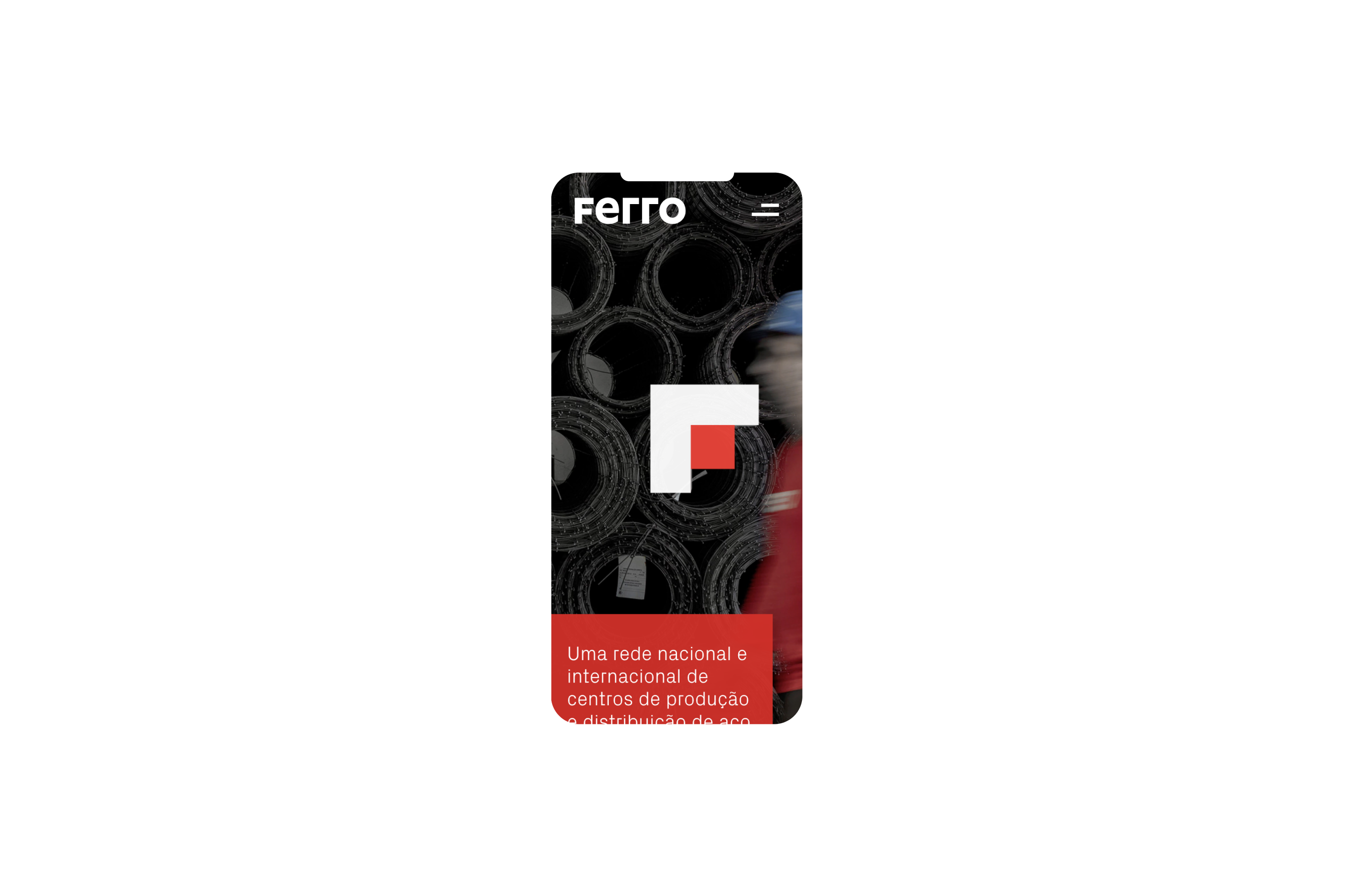
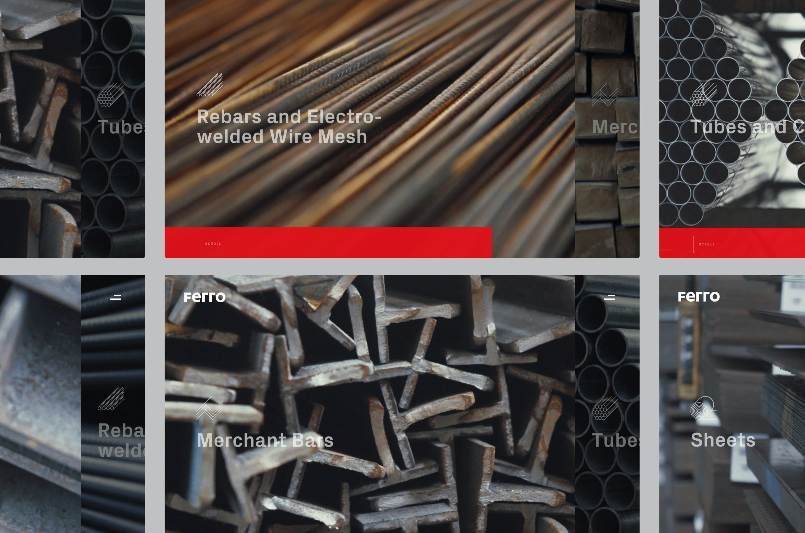
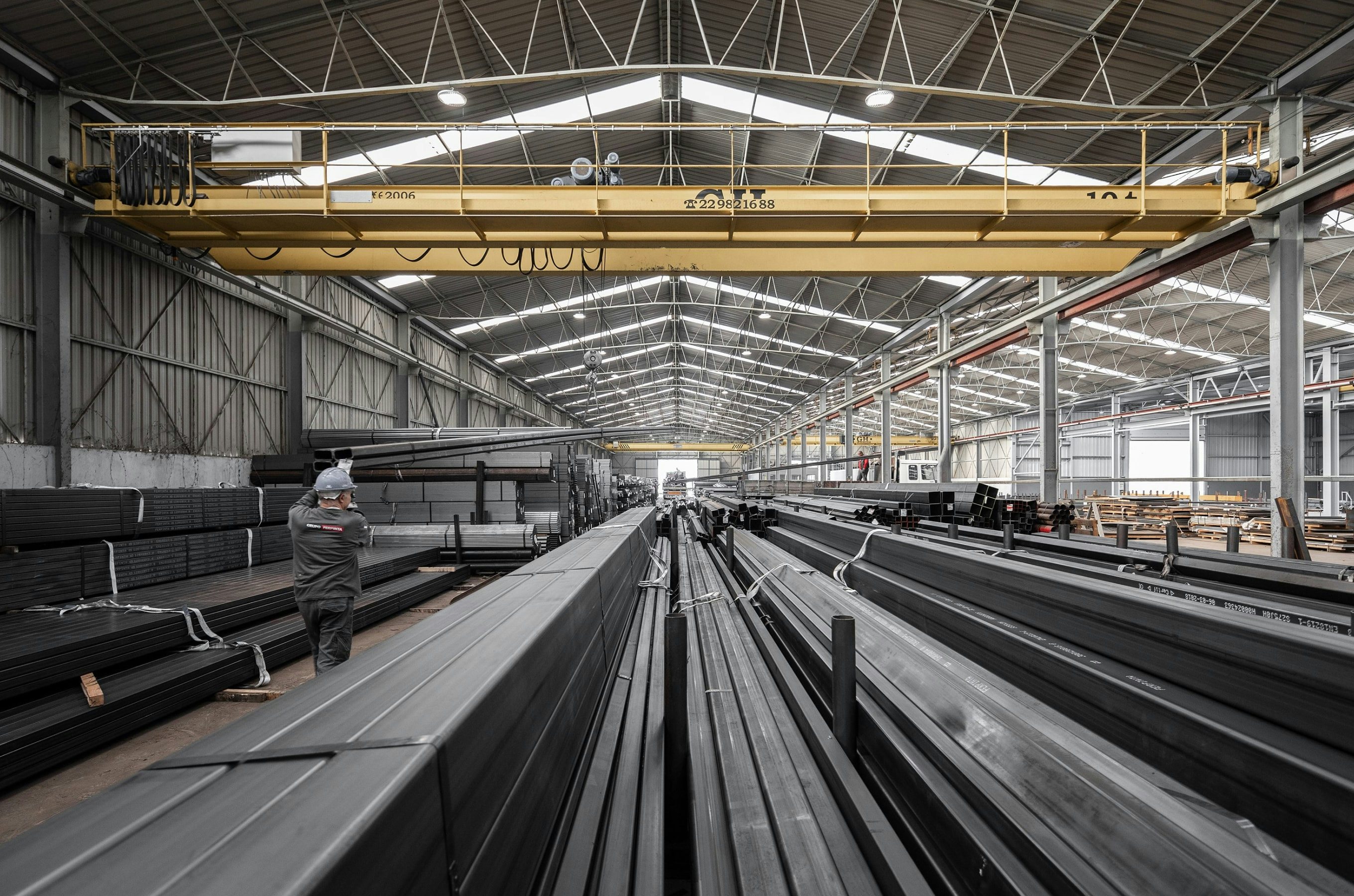
seeWebsiteHere ↗ - Ferro at Bürocratik
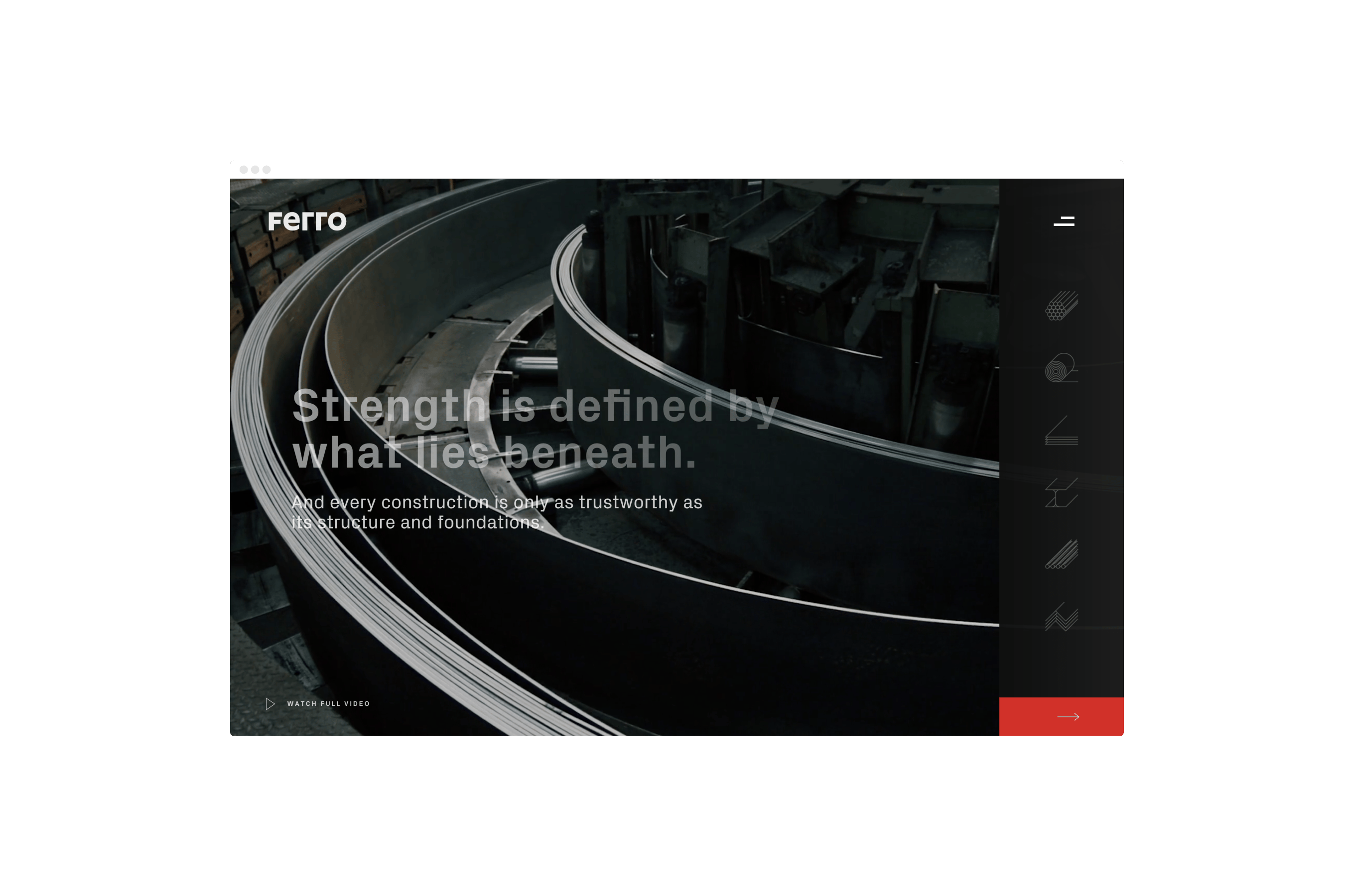
 1—4
1—4Communicating strength through the beauty of details
As part of the Bürocratik team, I worked as a designer on the website and helped with the art director for photography and video for Ferro — a steel production company. The main goal of the website was to present the wide range of products and allow the user to move into the product detail page from a very intuitive and direct flow.
Photography and video aimed to present the products in opposite scales, from decontextualising the object from its universe and showing the raw details of the material, to revealing the products as a whole, at the moment of its manufacturing.
seeWebsiteHere ↗ - Nevoazul as a Side Project
 1—4
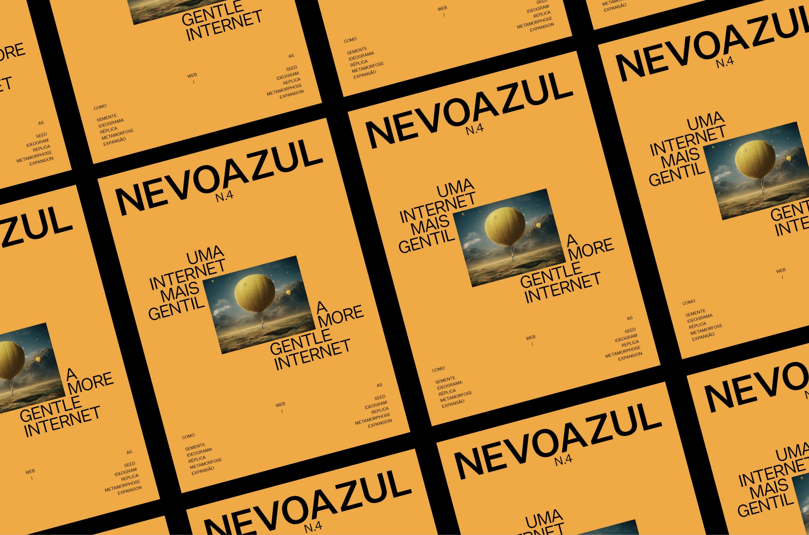
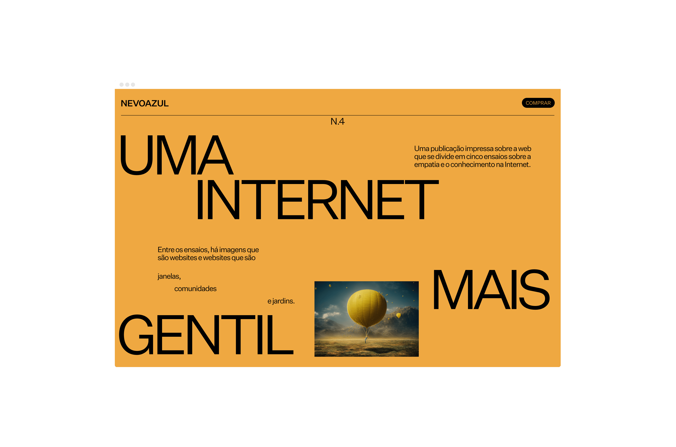
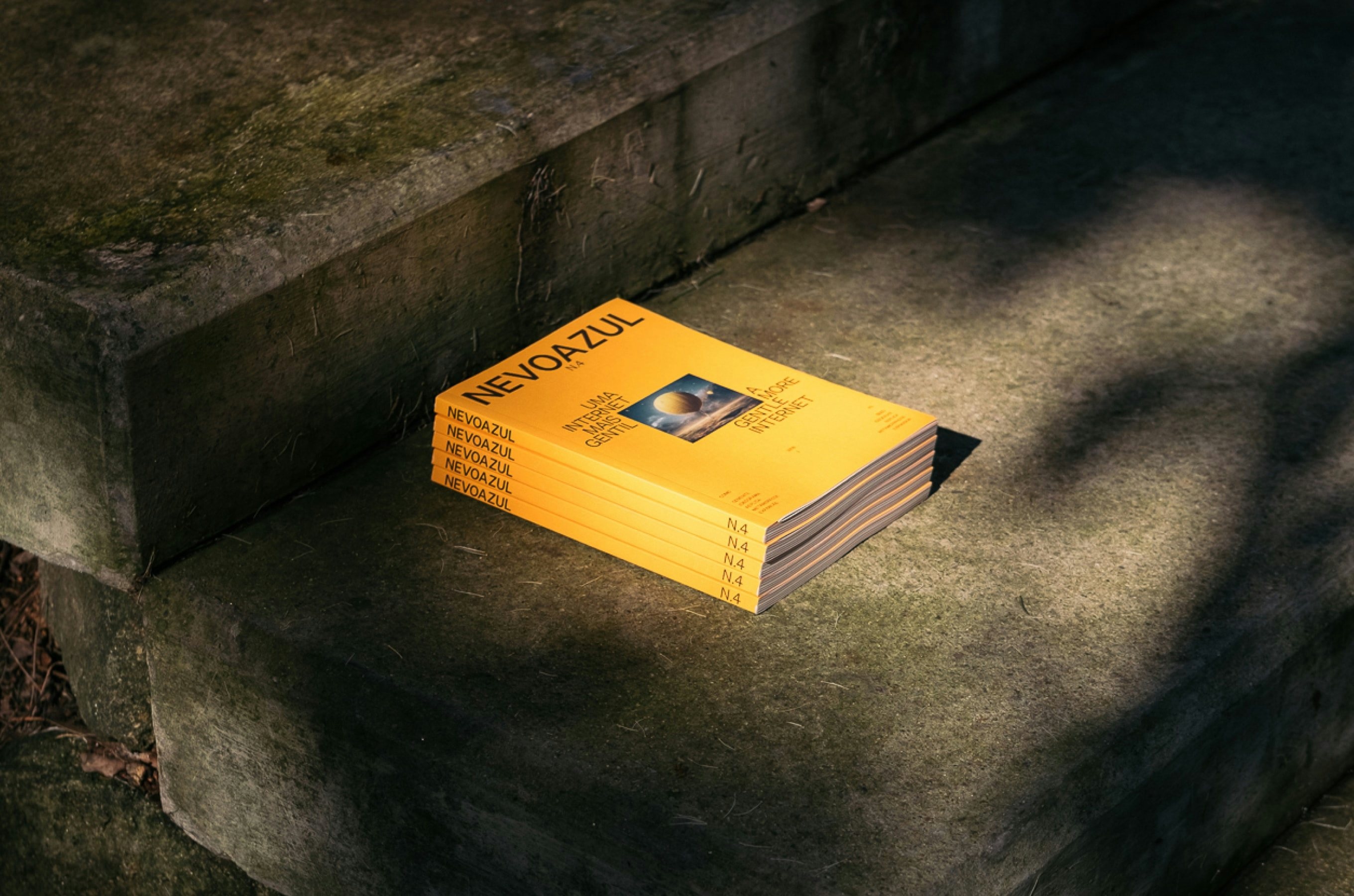
1—4There’s this place where we talk about the good side of the internet
Nevoazul is a bilingual magazine that explores the relations humans have with technology, in a society driven by information. In 2019, and with a change in the magazine’s own theme and concept, Nevoazul invited me to rethink its communication and publication design. The new design works white space as an integral part of the editorial design, thus giving the reader a quiet space to absorb the information and disconnect from technology.
In 2022, the new issue was dedicated to “A More Gentle Internet” and reflected on today’s web as a space for knowledge and empathy. I continue the collaboration with Nevoazul to create the new issue, that searched to be a mirror of its own time, with the use of the AI software Midjourney to create unique images. Finally, in partnership with Onda, we worked on a landing page for this new issue of Nevoazul, creating a peaceful page, that allows the user to wander.
seeWebsiteHere ↗